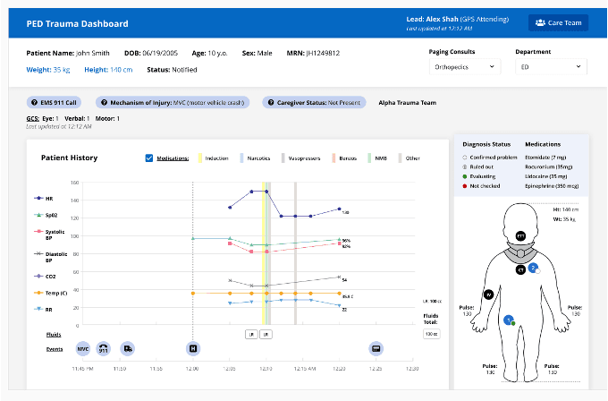
Pediatric Trauma Dashboard
Designed dashboard to improve team care and coordination for pediatric trauma patients
Role
UX Researcher and Designer
Industry
Healthcare
Duration
12 months


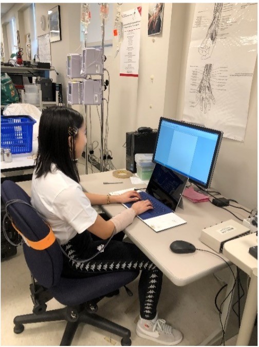
Usability Testing
Facilitated remote usability testing due to Covid 19 pandemic using wizard of oz strategy and a case vignette. At each step in the case, participants were asked "What information do you need to know, and can you find that on the screen?". Participants also completed a questionnaire with a modified system usability score.
Tested with 21 key stakeholders:
8 Emergency: 3 attendings, 2 fellows, 2 nurses, 1 pharmacist
6 Pediatric ICU: 3 attendings, 1 fellow, 2 nurses
6 Surgery: 2 attendings, 1 fellow, 2 residents, 1 nurse practitioner
1 Social Worker
Results
What worked well:
Vitals timeline
Mannequin as the "problem list"
Primary and Secondary Surveys
"I like the visualization of a patient and where things are. So, the IV, the ET tube, the collar, where the injuries are, I think that is helpful"
What did not work well:
Colors and display for medication, GCS, diagnostic certainty
Missing information for allergies and other vitals
Hover- over features
"I think it's a little hard for something like temperature when the scale is so different that- like, I might not pick up the blood pressure and heart rate trends visually are most important. So, you're going to lose some discriminating ability with that"

Other projects
Going Short: Laptop Keyboard Ergonomics Evaluation
Evaluate mobile technology designs’ effects on biomechanics, performance, user experience and whether there is a sex/gender difference in the biomechanical exposures caused by technology.

Videoconferencing for D/deaf and Hard of Hearing Signers

Teaching
Improving human-centered design education through inclusive, student-centered course and curriculum design